This is a follow-up to this post which discusses correlations between population density, race/ethnicity, and voting trends in the 2016 election. In that analysis, we ran a RandomForestRegressor on population density vs 2016 voting trends and found that it had a R2 score of 0.315. In the following analysis we will re-run the analysis using 2020 data and discover whether there is a stronger or weaker correlation than in 2016.
2020 County Level Election Map
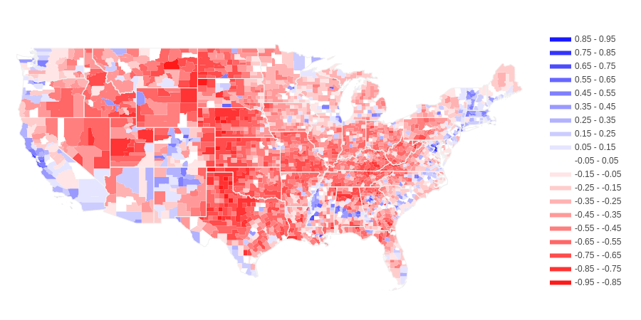
Source: https://github.com/tonmcg/US_County_Level_Election_Results_08-20
Population Density Map
(yellow is more dense, purple is less dense)
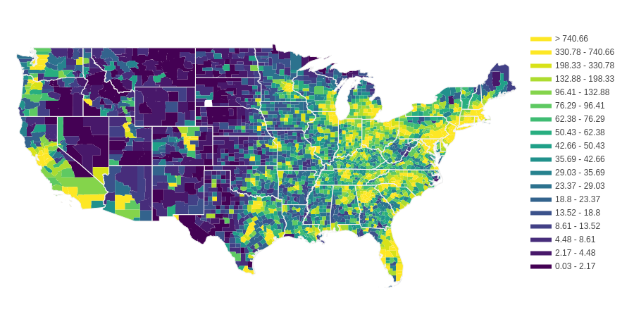
source (population): https://www2.census.gov/
source (land area): https://www.census.gov/library/publications/2011/compendia/usa-counties-2011.html
Trends
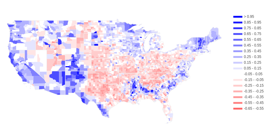
I ran a RandomForestRegressor on population density vs. 2020 election results and found that it yielded an R2 score of 0.356. This is marginally higher than the 2016 score of 0.315. I subtracted the predicted voting patterns from the actual voting patterns and came up with the following difference-from-trend chloropleth. Blue means Democratic voters were underestimated, red means Republican voters were underestimated.
Conclusions
The increase in R2 score from 2016 to 2020 suggests that the cultural divide between cities and rural areas is becoming more distinct. Like in 2016, in 2020 there were regional trends in voting patterns that superceded the rural vs. urban divide.