This project is inspired by this post about how well population density predicts voting. Jake Low runs a logarithmic regression on population density vs voting patterns and finds that it has an R2 score of 0.219, commenting that this is “not great”. Then he creates a difference-from-trend chloropleth map of the actual voting patterns minus predicted voting patterns, and he notes that the areas with the largest difference tend to have high percantages of African Americans or non-white Hispanics.
I was curious if I could run a regression with X = (population density, percent African American or non-white Hispanic) and acheive a higher R2 score.
The source for my work can be found in this github repo: https://github.com/five-hundred-eleven/county-voting
2016 County Level Election Map
source: https://github.com/tonmcg/US_County_Level_Election_Results_08-16
Population Density Map
(yellow is more dense, purple is less dense)
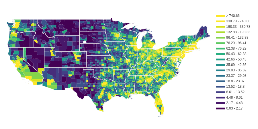
source (population): https://www2.census.gov/
source (land area): https://www.census.gov/library/publications/2011/compendia/usa-counties-2011.html
Trends
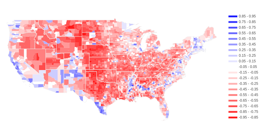
I ran a RandomForestRegressor (max depth of 5 to minimize overfit) with population density as X and voting trends as y. This yielded an R2 score of 0.315. This is higher than the R2 score of Low’s logarithmic regression. I then subtracted the predicted voting patterns from the actual voting patterns and came up with the following choropleth.
Blue means democratic voters are underestimated, red means republican voters are underestimated.
The areas in the South East that underestimated Democrats are consistent with areas with high populations of African Americans and/or non-white Hispanics.
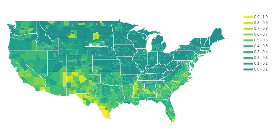
The following is a chloropleth map that shows high percentage of African Americans and/or
non-white Hispanics in yellow.
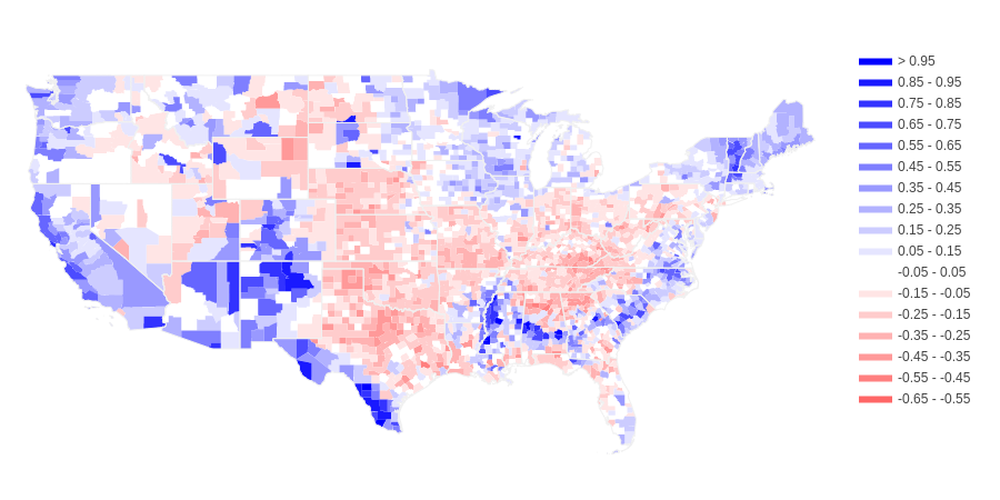
I ran a second RandomForestRegressor with population density and percent African American and/or Hispanic as X and voting trends as y.
This yielded an R2 score of 0.559, a notable improvement over using just population density. This lead to
the following difference-from-trend chloropleth:
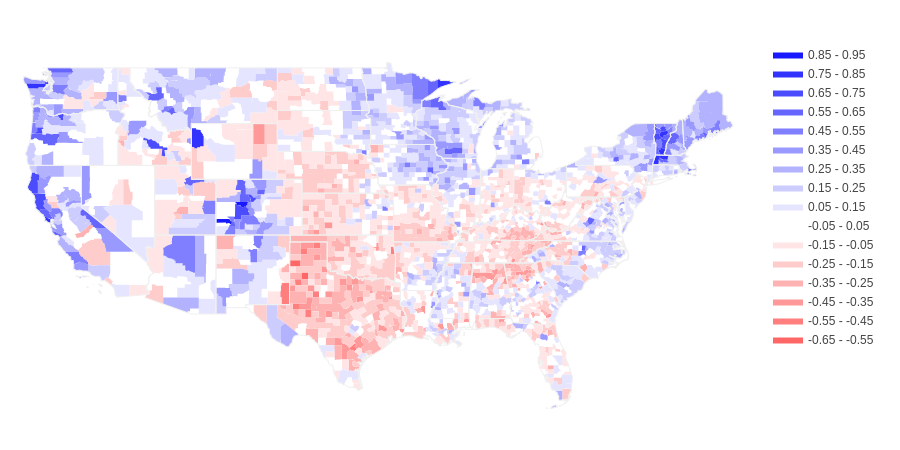
The predictions in the South are much improved, but some other areas of the country are still quite far off or even worse than using only population density. Interestingly, Democratic voting is still underestimated in many racially/ethnically diverse areas. This suggests that whites in diverse areas are more likely to vote Democrat than whites in non-diverse areas with similar population density. On the other hand, Republican voting is underestimated in areas with low percentages of African Americans and non-white Hispanics. Notable exceptions are the North East, Colorado and the West Coast. Vermont in particular is entirely much more blue than its population density and racial-ethnic composition would suggest.
Conclusions
The R2 scores suggest that there is a medium correlation between population density and voting as well as between ethnicity and voting. There are clearly regional trends in terms of voting patterns that override both population density and ethnicity.